
Design Systems, UX Patterns, and Storybook: What You Need and How AI Uses Them
A design system is a shared set of components, patterns, and rules that keeps a product consistent as it grows. Documented in a tool such as Storybook, it also gives AI design and coding tools something reliable to build from. A single small app may need only a component library; several products or teams usually need more.
Design is one area where we lean fully into AI, and a good design system is a large part of why that works. This guide explains what design systems, UX patterns, and Storybook are, how AI design and coding tools use them, and how much of a design system your product actually needs. It is part of our series on UX design for custom software.
What is a design system?
A design system is the set of reusable parts a product is built from, together with the rules for using them. It usually has three layers:
- Design tokens: named values for colour, type, spacing, radius, and shadow.
- Components: buttons, form fields, tables, navigation, and the other building blocks, each with its states.
- Patterns: proven ways of combining components to solve recurring problems, such as a search screen or a multi-step form.
The point of a design system is consistency without effort. When every screen uses the same parts, users learn the product once, and each new screen is quicker to design and build.
What are UX patterns, and why do they matter?
A UX pattern is a proven solution to a problem that appears again and again. Users already know how many of these work, so following a familiar pattern makes software easier to learn.
Common patterns in custom software include:
- Search, filtering, and sorting large lists
- Forms with validation and clear error messages
- Data tables with selection and bulk actions
- Onboarding and first-time setup
- Empty states that tell users what to do next
- Confirmation before destructive actions
Patterns matter even more with AI. When the product’s patterns are defined, AI designs each new screen with them, so a filter on one screen behaves like a filter on every other. Our pillar guide explains how this lets the technology drive the UX from the first draft.
What is Storybook, and what does it add?
Storybook is an open-source tool for building and documenting user interface components in isolation. Each component appears with its states and variants, such as a button that is default, hovered, disabled, or loading, so anyone can see exactly how it looks and behaves.
We use Storybook on client work. It gives designers, engineers, and AI tools one shared reference for the product’s components, and it makes gaps visible: if a state is missing from Storybook, it is probably missing from the product too.
What are design tokens?
Design tokens are named values that both design tools and code read. Instead of a hex code scattered across hundreds of files, a product uses names such as ‘colour-primary’ or ‘spacing-md’, defined once.
Tokens make a brand easy to apply and easy to change. If the primary colour changes, the token changes, and every screen follows. Our guide to AI-friendly brand guidelines explains how a brand agency can supply tokens from the start.
How do Claude Design and other AI tools use a design system?
AI design and coding tools work best when they have a product’s real parts to build with. Given tokens, components, and patterns, they compose screens from those parts rather than inventing new ones.
In design
We design and prototype with Claude. Claude Design builds a design system from a team’s codebase, design files, or uploaded brand assets, then applies its colours, typography, and components to new designs. Anthropic’s setup guide lists a codebase with a component library as one of the main inputs, which is why a well-documented component library pays off.
In code
The same principle applies when the software is built. Our guide on harness templates for AI coding puts it simply: user interface work that follows a design system is something AI can produce reliably, and user interface work that breaks it is not.
People still review every design and every change. A design system covers the common cases well, and the decisions it does not cover are where people spend their time.
Setting up a design system in Claude
If you use Claude Design, set the design system up so Claude can use it well. Sync it from your code where your tokens and components already exist, add usage notes to components, keep the overview short, and set one organisation default. We have rebuilt our own design system around Claude’s structure. Our post on Claude Design after 14 December covers the move from the standalone app and how we now run design systems in Claude.
Do you need a full design system, or is a component library enough?
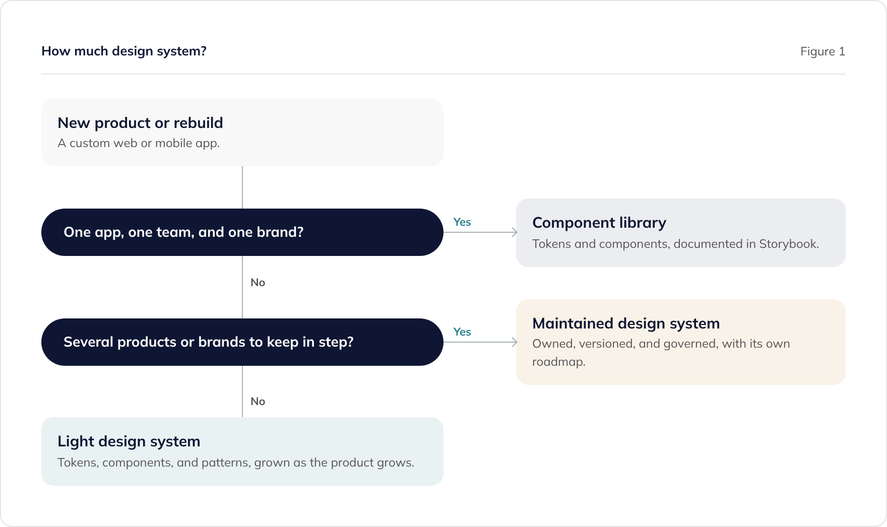
It depends on how many products, teams, and brands need to stay consistent. Figure 1 is a quick way to decide.
A component library
For a single app built by one team under one brand, a component library is usually enough. Shared tokens and components, documented in Storybook, keep the app consistent without the overhead of a separate system.
A light design system
When a web app and a mobile app share a brand, or more than one team works on the product, add documented patterns and simple usage rules to the component library. Grow it from real screens as they are built.
A maintained design system
When several products or brands must stay in step over years, the design system becomes a product in its own right. It needs an owner, versioning, a way to propose changes, and its own roadmap.
Most custom software projects start at the first or second level. Starting small and growing the system from real screens tends to work better than designing a complete system up front.
How do public sector design systems compare?
The GOV.UK Design System is a well-known example of a mature, public design system. It publishes styles, components, and patterns, all researched with users of government services. Central government services are expected to use it.
Private-sector teams usually have their own brand and their own design system, but the GOV.UK Design System is still a useful reference for accessible components and well-researched patterns. Our guide to applying the GDS Service Standard in the private sector covers how to use it alongside your own system.
Established commercial systems, such as Google’s Material Design and Microsoft’s Fluent UI, can also be a starting point. Applying your brand’s tokens to a proven base saves building every component from nothing.
How does a design system help accessibility?
An accessible component fixes an issue everywhere it is used. If the form field component has a proper label, visible focus, and a clear error message, every form in the product inherits them.
We design to WCAG 2.2 AA by default, and building accessibility into shared components is one of the most effective ways to keep it consistent across every screen. Our guide to accessible software design covers the standard and the law.
Who owns the design system at the end of a project?
With us, design files and the design system follow the same licence terms as the software itself. Our guide to software IP licensing and source code handover explains those terms.
Whoever owns it, make sure the handover includes the tokens, the components, and the Storybook documentation along with the code. A design system that only one supplier can find their way around is hard to hand to anyone else.
Where to go next
For how a design system lets UX cover the whole product, see UX on every screen. If you are bringing finished designs rather than a system, our guide to bringing your own designs explains what a development team needs.
To talk about component libraries and design systems for your product, book a consultation or read about our React development service.
Frequently asked questions
What is the difference between a design system and a style guide?
Do we need Storybook?
Can AI tools follow our design system reliably?
Can we start small and grow a design system?
Can we use Material Design or Fluent UI as a base?
Who owns the design system at the end of a project?
Related guides
Can AI Do UX Design? Where AI Helps and Where People Decide
What AI does well in UX design, from card sorting to synthesis, where people must decide, and how to use research data safely under UK GDPR.
Accessible by Design: Building Software That Meets WCAG 2.2 AA
How to design accessible software from the start, what WCAG 2.2 AA means in practice, and what UK public sector accessibility regulations require.
What to Ask an Agency About Its Design Process (and Who Owns the Designs)
The questions to ask a software agency about design: who does it, how ideas are tested, how accessibility is checked, and who owns the design files.